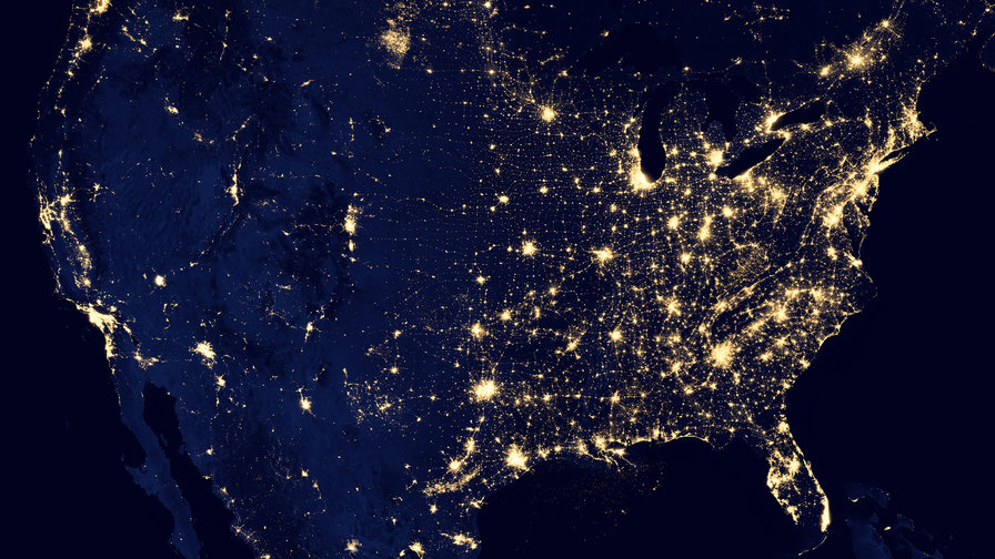
What does wealth look like… from space? This is the question researchers from Carnegie Mellon University wanted to answer when they built Penny. Penny is an AI built on machine learning using neural networks. Through an interactive website Penny lets you browse satellite images of New York City and St.
Louis and see how different kinds of features make an area look wealthy or poor to the AI.To build Penny, the researchers used household income data from the U.S. Census Bureau, mapped it, and overlaid it with satellite imagery. They color-coded areas to represent different income brackets. In the picture below, green represents areas with the highest quartile of annual income (averaging $71,876 and above), red represents areas with the lowest annual income (averaging $34,176 and below) and orange and yellow represent the middle levels of income (averaging between $34,176 and $49,904, and $49,904 and $71,876, respectively).

Census data mapped and color coded / penny.digitalglobe.com
The two layers of data — the color-coded map and the satellite images — were then given to a neural network which was trained to predict the average…
The post AI Can See America’s Wealth Inequality From Space appeared first on FeedBox.