Author: Miss Cellania / Source: Neatorama

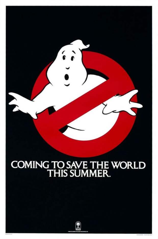
Like many branding logos, the familiar Ghostbusters icon went through a lot of changes before the filmmakers settled on a final design. But it wasn’t designed for marketing purposes- this one was part of the prop department. The ghost with a red line was going to be a logo used in the movie for our heroes’ ghost extermination business.
It turned out pretty good considering how little time was spent on it.But again, this was going to be a relatively small logo you’d only see on the costumes, outside the fire station, and on the side of the Ecto-1. So the art department “didn’t think twice about it,” because they had a…
The post The Ghostbusters Logo Only Became Famous Because Of A Legal Screw-Up appeared first on FeedBox.