Author: Emily Ludolph / Source: 99U by Behance

One can create an amazing logo, but so much of a visual identity’s success is wrapped up in external factors, particularly the fate of the company itself. With no guarantees that one “big break” will lead to another, the designers behind the Apple, Google, and Pinterest logos realized they must develop their own barometers for success.
It was 1977. Robert Janoff had been out of school for seven years and was working at public relations and advertising firm Regis McKenna in Palo Alto, California. Intel was one of his biggest accounts.
One day, a guy entered the office holding a machine that looked vaguely like a typewriter. With long stringy hair and holes in his jeans, he was looking for the person working on Intel’s ads. His name was Steve Jobs, and he very much wanted Janoff to design the logo for his new company, to be put on the Apple II computer.
“Talk about being in the right place at the right time,” says Janoff, now 70.
The only direction he received from Jobs was to “not make it cute.” Janoff got to work, designing what would become one of the most iconic logos on the planet. He played with the dichotomy of a complicated electronics company having the name of a simple fruit, focusing on an apple shape and adding in the bite for scale and the multicolor stripes as a way to represent the test pattern bars shown on computer screens.
He presented only this one idea to Jobs. “I just did the one – I have never done that after that,” Janoff says. “I was so clear this was exactly the thing it should be that there weren’t any alternatives.”
Fortunately, Jobs approved – and the logo, while tweaked in the coming years, remains Janoff’s original design.
“Today, when I go into an airport and everyone’s on their laptops, I’ve got these little white logos looking at me all over the place,” says Janoff. “It’s a great reward to see it all over the place.”
It’s easy to imagine that Janoff’s life changed the day he created that logo. But it took years for Apple to become the trillion-dollar tech giant it is today, years for its logo to brand itself in consumers’ minds. And the reality is, if Apple hadn’t become a great company, Janoff’s great logo might have faded into oblivion.
“Success is not a certificate that promises you smooth sailing after that.”
That’s the thing about logo design – so much of its success is wrapped up in external factors, particularly the fate of the company itself. With no guarantees that one “big break” will lead to another, designers must develop their own barometers for success.
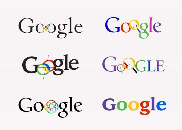
Ruth Kedar, the designer behind Google’s original logo, came to terms with that reality long ago. “I am absolutely positive that if Google had not gone to the great heights that it has gone, and that if the Google logo had not become the most ubiquitous design of all time, you would not be talking to me,” she says.
Kedar, 63, had been introduced to Sergey Brin and Larry Page through a mutual friend while she was teaching at Stanford. Recognized for her forward-thinking approach and interest in arts and technology, the two founders sought out Kedar for their Google logo. Using a unique Catull typeface, Kedar set out to create a logo that was approachable, disruptive, and different, with an anti-establishment tone.

The post After an Iconic Logo, What’s Left to Create? appeared first on FeedBox.