Author: J.D. Roth / Source: Get Rich Slowly
Inflation is the silent killer of wealth. Year after year, the purchasing power of your dollar (or pound or euro or yen) gradually erodes. My father was one of those “hide money under your mattress” type folks because he believed that was the best way to keep his cash safe.
He was wrong.If you sit on your money, it doesn’t maintain its value. It loses value.
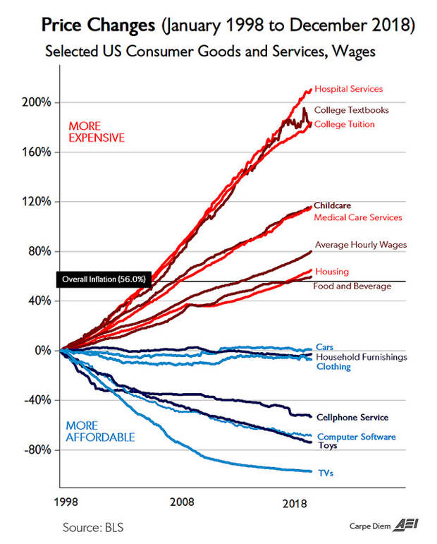
At his Carpe Diem blog, economics professor Mark Perry recently published a new version of the following chart, which visualizes the effects of inflation on certain consumer goods and services.

As you can see, this chart tracks 21 years of inflation data: from January 1998 to December 2018. (Perry uses official Consumer Price Index data from the U.S. Bureau of Labor Statistics.) He writes:
During the most recent 21-year period from January 1998 to December 2018, the CPI for All Items increased by exactly 56.0% and the chart displays the relative price increases over that time period for 14 selected consumer goods and services, and for average hourly earnings (wages). Seven of those goods and services have increased more than average inflation…The other seven price series have declined since January 1998.
In the chart, the black line indicates average inflation over the past 21 years. Red lines indicate items that have increased in price at rate faster than inflation; blue lines have decreased in price relative to inflation.
If you read the accompanying blog post — and especially the comments that follow — you’ll see that people are quick to jump to partisan conclusions regarding this chart.
“The more expensive stuff is a result of socialism and government regulation!” “The less expensive stuff is open to free market competition.” (These comments aren’t surprising considering the blog is published by a conservative think tank.)I believe these responses are overly simplistic. Besides, they miss the really interesting stuff.
For instance, look at the price of televisions. According to the CPI, the price of TVs has declined 97% in the past 21 years. I think we all know that’s not actually the case. TVs have grown more expensive, along…
The post Twenty years of U.S. government inflation data appeared first on FeedBox.