Author: Natasha Frost / Source: Atlas Obscura
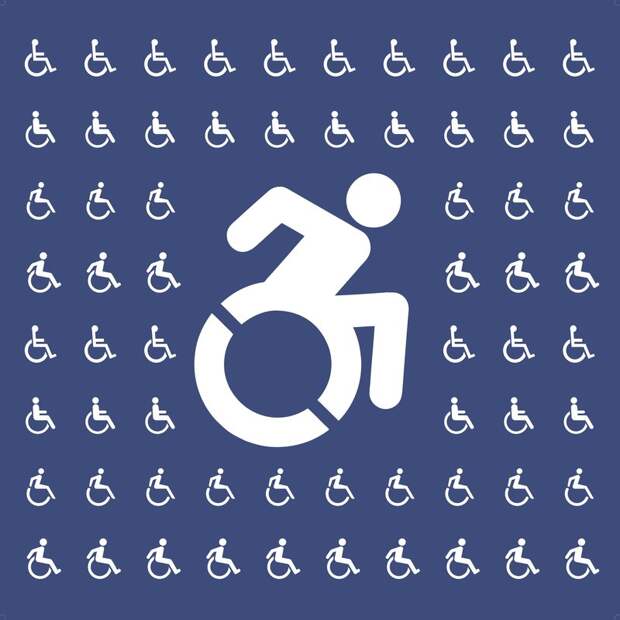
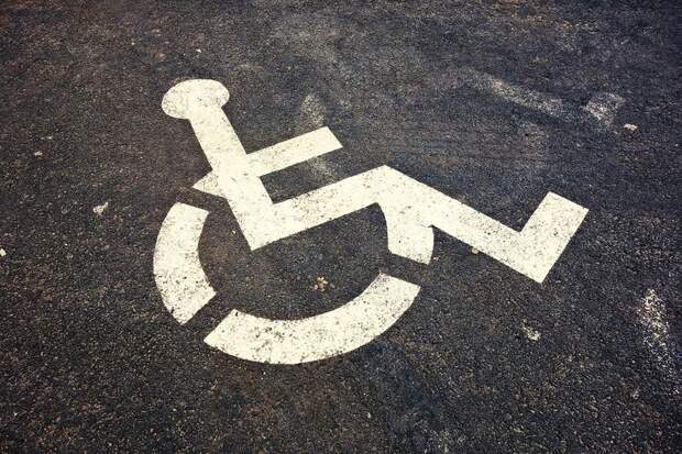
Just 50 years ago, the International Symbol of Access did not exist. Known variously as the Wheelchair Symbol and “the little blue sign,” the icon features an individual sat on their wheelchair, apparently motionless, with their arms perched on the sides.
Created by the Danish design student Susanne Koefoed in 1968, in the original version, the person on the wheelchair was missing a head.Today, the ISA appears all throughout the built environment: bathrooms, accessibility ramps, automatic doors, parking lots. It has become part of the world’s ISO-ordained pictographic vocabulary—as instantly recognizable as signs that tell you which bathroom to use, where the elevators are, or not to smoke. For decades, it has served as a way to tell people with disabilities “you are welcome here,” in a world that doesn’t always make the arrangements for accessibility that it should.
“It’s something that we sort of take for granted,” says Rochelle Steiner, co-curator of the exhibition Access+Ability currently on show at the Cooper Hewitt, Smithsonian Design Museum in New York. “That we see all over the U.S. and all over the world as a symbol of disability.”
Over the last few years, however, a rogue icon has rolled quietly into sight. The “Accessible Icon,” as it’s known, began as a Boston-based street art project. In the past eight years, however, it has mushroomed into an international movement, with the symbol now on signage around the world.
The symbol has even been codified in emoji, appearing on iOS devices in a cluster of blue squares, between P for parking and WC for water closet. Yet however ubiquitous it may appear, this rival wheelchair symbol has prompted a spectrum of reactions. It has variously been called ableist and empowering, and been deemed federally illegal and officially rejected by the ISO, despite having been adopted by the states of New York and Connecticut. But where did it come from, and why has it provoked such controversy?The Accessible Icon was by no means the first attempt to adjust the 1968 Wheelchair Symbol. Around 2009, the design and disability studies researcher Sara Hendren began cataloguing alternative accessibility icons on her blog, Abler, where she also tracked developments in prosthetics and topics related to the human body. Without fanfare or hubbub, in certain corners of urban space, the figure in the wheelchair had been ever-so-slightly adjusted. In some iterations, the person’s body was simply less blocky, with organic, rounded shoulders and arms—arguably more recognizably human than Koefoed’s original stick figure. In other variations, the person’s arms reached back to push their wheels.
Hendren began to notice these altered icons across the United States—in the bathrooms of MOMA in New York, for instance, or in a Marshalls department store in Cambridge, Massachusetts. They were subtly different—in the Marshalls version, speed lines had been added to show a person in motion—but each made some effort to show a person with disabilities moving around the world. Brian Glenney, a graffiti artist and philosophy professor at Norwich University in Vermont, saw potential for a project. In a comment on Hendren’s original blog post in late 2009, he wrote: “I suggest a tagging run of these. We create the signage and ‘replace’ old signs … What would be best is an ‘overlay’ design, that makes use of the passive wheelchair image but makes it active.”
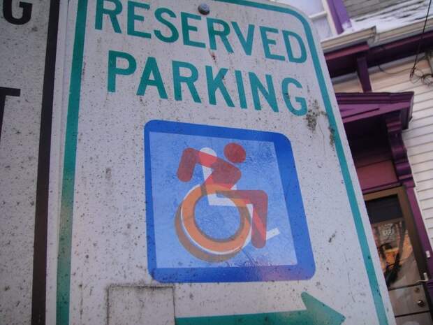
Together, Glenney and Hendren designed a transparent overlay of a person in a wheelchair, colored a vivid orange. The figure in the wheelchair seems dynamic—the outline of two wheels suggesting furious motion, with their torso shunted forwards, as if propelling themselves into some glorious unknown. In 2011, around 1,000 of these icons were pasted over the top of existing accessibility icons around Boston, in an attempt to generate questions about what Hendren describes…
The post The Controversial Process of Redesigning the Wheelchair Symbol appeared first on FeedBox.