Author: Anne Quito / Source: 99U by Behance
The World Cup logo has been at the center of FIFA’s marketing and branding effort over the past 15 years as it evolved from a soccer organization into a global cultural powerhouse.
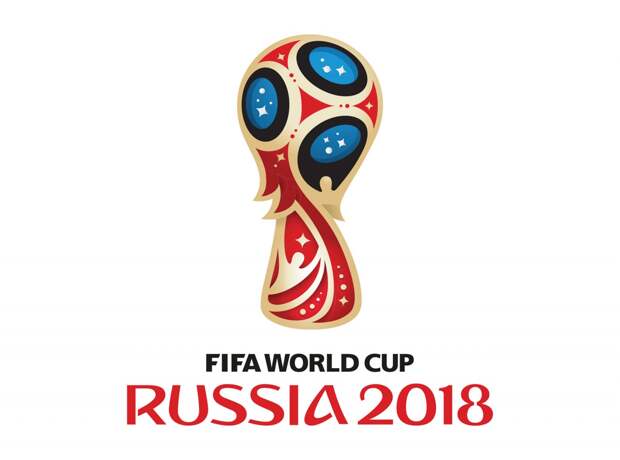
“Global sports are, somehow, containers of hope,” says Miguel Viana, the Lisbon designer who, while working at Brandia Central, designed the Official Emblem of Russia 2018: a World Cup trophy that swirls upward, in plumed panels of gold, red, blue, and black.
Four-pointed stars twinkle in rounded blue portions of the trophy, symbolizing Russia’s achievements in space exploration. Other pieces reference the Red Square’s Saint Basil’s Cathedral. This can all be seen plainly in the logo, which isn’t a subtle piece of work. It can also be read about in the press release FIFA issued in 2014, after unveiling the logo with a light projection splashed across the entire facade of the Bolshoi Theatre in Moscow.However, Viana can’t talk about any of it, beyond acknowledging that, yes, he was the creative director. “It’s part of the contract we have with FIFA,” says Viana, who has since gone on to found Un—lock branding studio. “It’s not possible to talk.” FIFA representatives also declined to talk, citing a tight schedule. In lieu of that, the international soccer organization offered a 10-page media background document on the brand elements, pointing out ways the “magic ball” of the emblem “unites magic and dreams.”
The Official Look, an illustrated tableau with folk figurines and symbols for the 11 Russian host cities, and the posters for each of those cities, are in the document as well. As is a single page about the physical, gold-plated trophy that World Cup winners compete for: “The FIFA World Cup Trophy has become the most sought-after and recognised sports prize in the world and can be seen as a truly unique universal icon,” it reads.
At the end: “As with all of FIFA’s event brand assets, the image of the FIFA World Cup Trophy is also subject to extensive intellectual property protection.”And of course it is: FIFA earns most of its revenue from broadcast deals. In 2014, FIFA pulled in $4.8 billion in revenue; projections for the 2018 event hover around $5.6 billion. With each broadcast and ticket sale, the logo appears. The brand is an expensive one.
Tight-lipped creative directors and non-disclosure agreements abound in the design and branding world, but as recently as the mid-1990s, that wasn’t the case. Before 2002, the World Cup carried practically no traces of the FIFA brand. The quadrennial event came with posters and a tag with the year and the host country’s name. Usually, a slightly abstracted soccer ball graphic would run along with that text. Some of these rose to icon status: mid-century graphic designer Lance Wyman’s striped op art-like type work for Mexico 1970 remains a classic. The catch is that he didn’t create it for FIFA or the World Cup; the logomark riffs on Wyman’s brand for the 1968 Olympic Games in Mexico City, contorting the same typography into a fraternal twin of a logo.
“There was no overt FIFA branding in those identities and the logos,” says Andy Mulligan, who at that time worked at Interbrand in London. “For many reasons at the time, that didn’t particularly matter.” Then forces shifted: first, sportswear companies like Nike and Adidas — or perhaps almost exclusively Nike and Adidas — grew into corporate powerhouses. Through massive sponsorships, they dressed entire teams and their logos decorated stadiums. Mulligan says many viewers at the time assumed that Nike or Adidas, or both, had an official hand in throwing the World Cup.
The second force was Michael Jordan. (Technically, it was American basketball as a whole. But from a branding perspective, can one really separate the two?) “By the mid-’90s the NBA had become a pretty well known global brand,” Mulligan says. “And football” — soccer — “and basketball are possibly the only two sports that can be truly international, because they’re incredibly easy to play anywhere.” With the NBA gaining global recognition, fueled by the megawatt star power of Jordan and his contemporaries, soccer risked losing presence. “FIFA wanted to make sure that football remained the great world sport,” Mulligan says.
From 2002, all World Cup logos would be tagged as a FIFA property, represented by a stylized twist on the shape of the physical gold trophy.
So ahead of the 2002 World Cup, which Japan and South Korea co-hosted, FIFA threw its weight into becoming a globally recognized brand. The association hired Interbrand to…
The post A Brief History of the FIFA World Cup Logo appeared first on FeedBox.